Landscape Composition Techniques
This section is dedicated to Galen and Barbara Rowell, nature photographers of world renown, who died in a plane crash near Bishop, California in August, 2002.
The familiar skills described below have been taught by landscape photographers worldwide for generations; basic compositional techniques have not changed much since the Italian Renaissance. They remain relevant today, even as imaging technology makes its rapid transition from silver hydride emulsions to complementary metal oxide semiconductors.
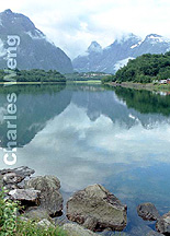
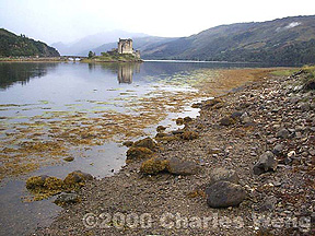
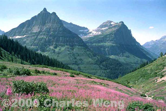
Divide the frame into four or more horizontal layers, and fill at least 75% of those layers from the bottom up. This is my take on the time-honored "rule of thirds." Rule of fourths (or more) works better to minimize compositional dead space, typically the sky. Unless there are clouds, hot air balloons or whatnot that break up the firmament into patches of contrasting tones, the sky is too often just a dull, blank field. Without a dominant subject to fill the frame, this layering technique can become rather obvious – should such be indeed a desired effect. When your layers do occur in even numbers, take care that they do not cut your image in half (see below).
 Keep
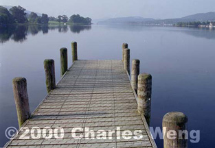
the horizon far away from the center. A
horizon at dead center arbitrarily cuts your composition in half, lessening the visual
impact of either half. Too close to a third
from the top or bottom, and you betray yourself as a pedantic follower of the "rule
of thirds."
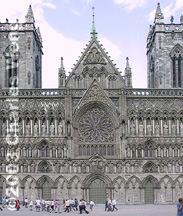
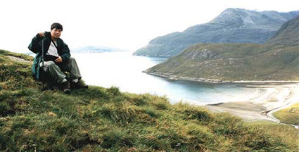
Include human-scale objects in the foreground of a large scene. A common example is to include people standing near a mountain or tall building. This creates a sense of scale, affirming the stature of larger-than-life objects which must appear in miniature through the camera lens. Placement of similarly-sized objects that get smaller into the background also provide a cue for depth and distance.
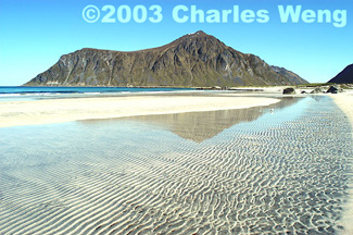
Look for diagonal lines. Diagonals keep the eye moving across the entire frame, adding grace as well as energy to the composition.
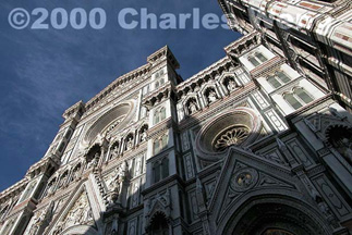
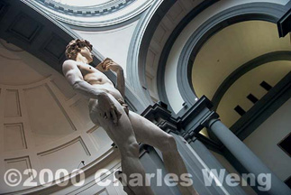
Create diagonal lines. Diagonals can be arbitrarily created via camera handling to achieve a dramatic perspective.
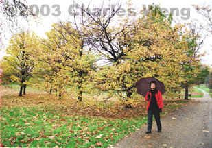
Incorporate people into the scenery. Full figures of people, feet included, give a better sense of their placement within a sweeping landscape. Instead of stiff standing poses, subjects should be encouraged to interact with their environment: sitting, leaning, climbing, walking, pointing, taking pictures, etc. Keep the viewer's eye moving throughout the entire composition by positioning people away from the center, unless the intended visual movement strongly radiates from the central subject, as in a priest speaking from an altar.
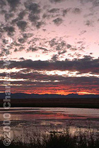
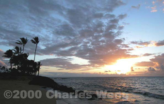
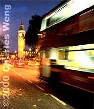
Get out early, leave late. Twilight, or "magic time," creates the most varied gradation of tones within a single composition without resorting to filters or digital processing. When in doubt, minimize your camera aperture, slow down the shutter speed and use a tripod. Knowing the orientation of your subject will let you decide whether your stakeout will be at dawn or dusk, but do keep in mind your lens will not always point directly towards the sun, but also that which reflects its radiance.
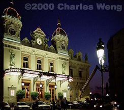
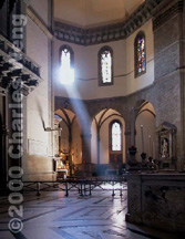
Acquire available light. Available light illuminates the scene as the photographer sees it, giving immediacy, authenticity and discretion to his composition. Use a tripod or hold your camera steadily as you allow the time for the open shutter to collect enough light.
Available-light techniques are especially important in places where it is not a good idea to use flash, such as inside a museum. Be mindful of many cameras that activate the flash automatically in "program" mode, as well as some models that persistently fire a beam of "focus-assist" light even when the actual flash is turned off.
Available light can be tricky. Chances are that your film or digital sensor will have captured enough visual information to make a good shot, even though the initial result may look otherwise. Some wizardry with your Photoshop-equipped computer will be in order (see link to digital image processing below).
Photos from top left:
|
Michelangelo's David at the Academy of Fine Arts, Florence, Italy | |
| Back to top |

